Design system
Design system
Building Vo 2.0
Building Vo 2.0
Building Vo 2.0
Vo is the name the design team gave to our design system. It was derived from Voyance.
Vo is the name the design team gave to our design system. It was derived from Voyance.
Vo is the name the design team gave to our design system. It was derived from Voyance.
Summary
Summary
01
Role
Product designer
02
Overview
We conducted user interviews, surveys, and analyzed in-app analytics to understand the pain points and user needs. We also studied competitor apps and industry trends to gather insights
03
Challenge
We conducted user interviews, surveys, and analyzed in-app analytics to understand the pain points and user needs. We also studied competitor apps and industry trends to gather insights
04
What I did
We conducted user interviews, surveys, and analyzed in-app analytics to understand the pain points and user needs. We also studied competitor apps and industry trends to gather insights
05
Takeaway
We conducted user interviews, surveys, and analyzed in-app analytics to understand the pain points and user needs. We also studied competitor apps and industry trends to gather insights

How it all went down
How it all went down
Introduction
Introduction
The Why
The Why
The Why
Take your love of food to the next level.
When I joined Voyance in 2021, there was an existing design system used by designers across all products and referenced by developers.
In 2023, the design team lead, Sebiomo, and I realized that this design system had become redundant and ineffective. We identified a key issue: lack of stakeholder involvement.
When Vo 1.0 was designed, major stakeholders like developers, brand designers, and product marketers were not consulted. This led to a fragmented design system, causing inconsistencies in user experience and difficulty maintaining brand coherence across various platforms. Additionally, there was an accessibility issue, as the colors did not pass the WCAG test.
To address these problems, we set out to redesign the design system, resulting in the creation of "Vo 2.0."
Research & Discovery
Research & Discovery
Getting started
Getting started
Getting started
Getting started
As with most projects, our journey began with an extensive research phase to understand the existing pain points and gather insights from various stakeholders.
As with most projects, our journey began with an extensive research phase to understand the existing pain points and gather insights from various stakeholders.
Stakeholder Interviews
Stakeholder Interviews
Stakeholder Interviews
Stakeholder Interviews
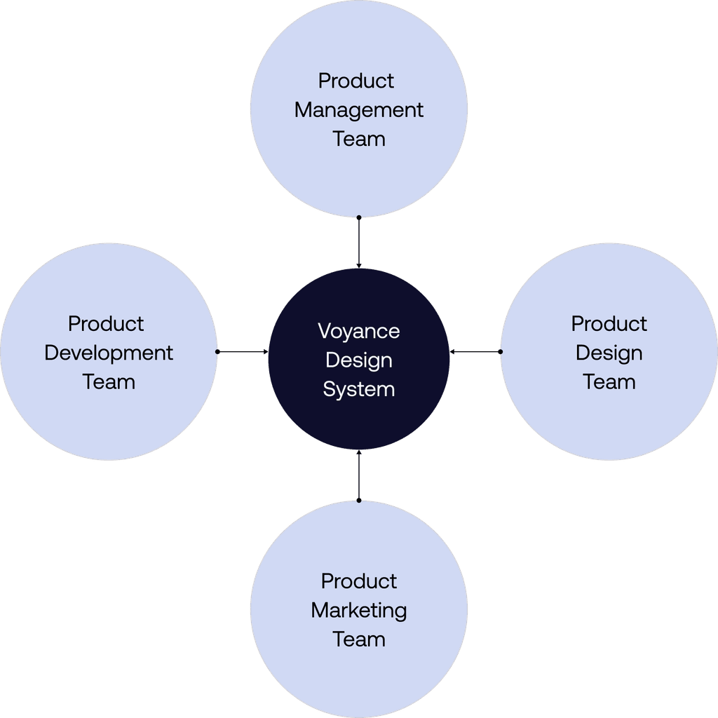
We conducted interviews with key stakeholders from different departments, including product managers, developers, and marketers, to understand their needs, frustrations, and aspirations for the new design system.
We conducted interviews with key stakeholders from different departments, including product managers, developers, and marketers, to understand their needs, frustrations, and aspirations for the new design system.
We conducted interviews with key stakeholders from different departments, including product managers, developers, and marketers, to understand their needs, frustrations, and aspirations for the new design system.
We conducted interviews with key stakeholders from different departments, including product managers, developers, and marketers, to understand their needs, frustrations, and aspirations for the new design system.

User Interviews/Demo Sessions
User Interviews/Demo Sessions
User Interviews/Demo Sessions
User Interviews/Demo Sessions
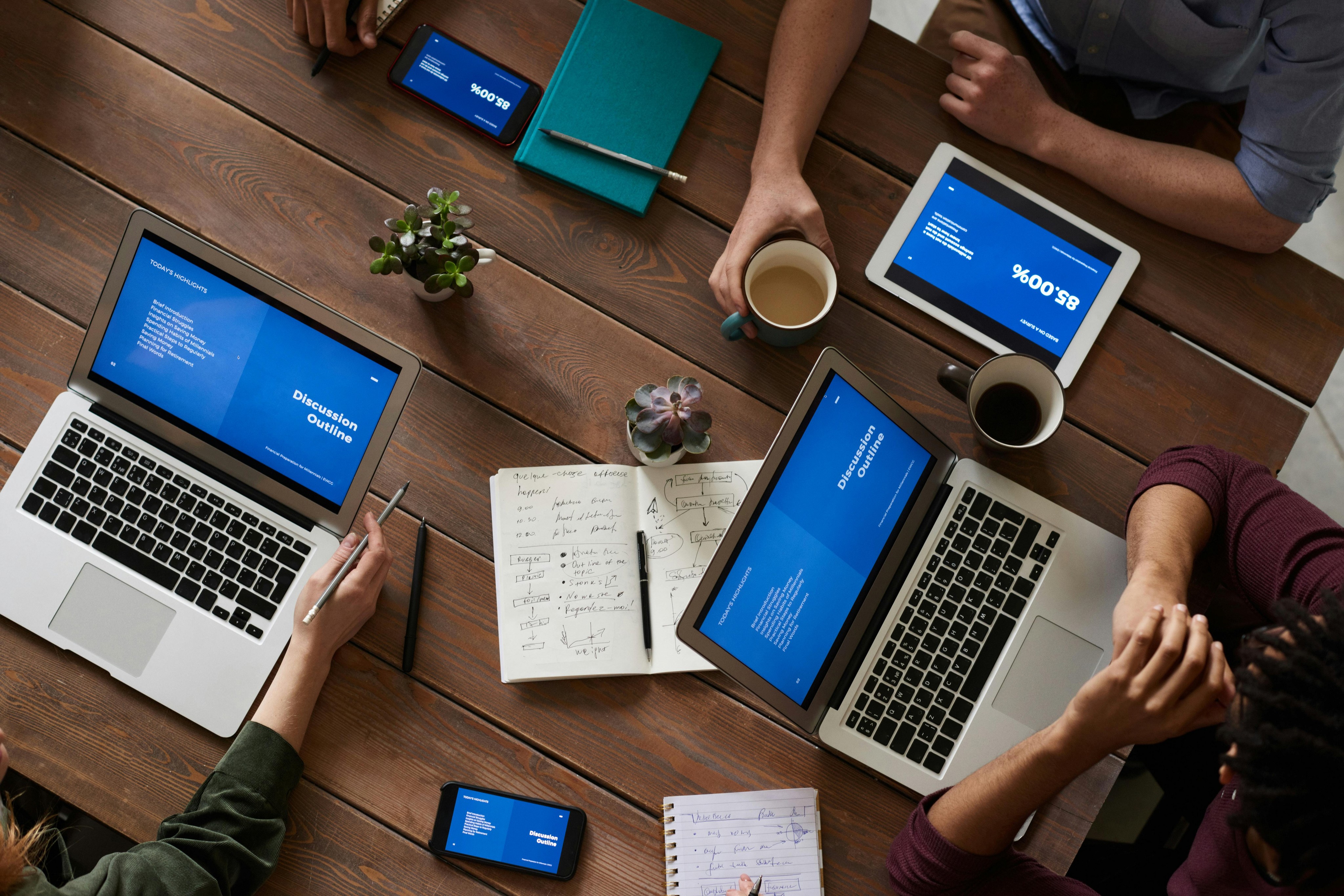
We held demo sessions with some of our users to get feedback on their experiences with the existing products. We needed to know if the existing UI patterns fit the Voyance standard. This helped us identify common issues and areas for improvement.
We held demo sessions with some of our users to get feedback on their experiences with the existing products. We needed to know if the existing UI patterns fit the Voyance standard. This helped us identify common issues and areas for improvement.
We held demo sessions with some of our users to get feedback on their experiences with the existing products. We needed to know if the existing UI patterns fit the Voyance standard. This helped us identify common issues and areas for improvement.
We held demo sessions with some of our users to get feedback on their experiences with the existing products. We needed to know if the existing UI patterns fit the Voyance standard. This helped us identify common issues and areas for improvement.

Competitive Analysis
Competitive Analysis
Competitive Analysis
Competitive Analysis
We analyzed the design systems of industry leaders and competitors to benchmark best practices and identify opportunities for innovation.
We analyzed the design systems of industry leaders and competitors to benchmark best practices and identify opportunities for innovation.
We analyzed the design systems of industry leaders and competitors to benchmark best practices and identify opportunities for innovation.
We analyzed the design systems of industry leaders and competitors to benchmark best practices and identify opportunities for innovation.


Objectives
What was the point?
What was the point?
What was the point?
What was the point?
After analysing the results of our research, we all agreed that we wanted to make Vo 2.0 more consistent and remove components that were not useful.
Our main objectives were;
to create a unified and flexible design language
to enhance accessibility standards, and
to streamline the development process for faster iterations.
However, we recognized that building a design system is an ongoing journey. It requires commitment from all teams for continuous updates. Despite the extensive planning needed, we believed the long-term rewards would be well worth the effort.
However, we recognized that building a design system is an ongoing journey. It requires commitment from all teams for continuous updates. Despite the extensive planning needed, we believed the long-term rewards would be well worth the effort.


Strategy & Planning
Strategy & Planning
Getting to work
Getting to work
Getting to work
Getting to work
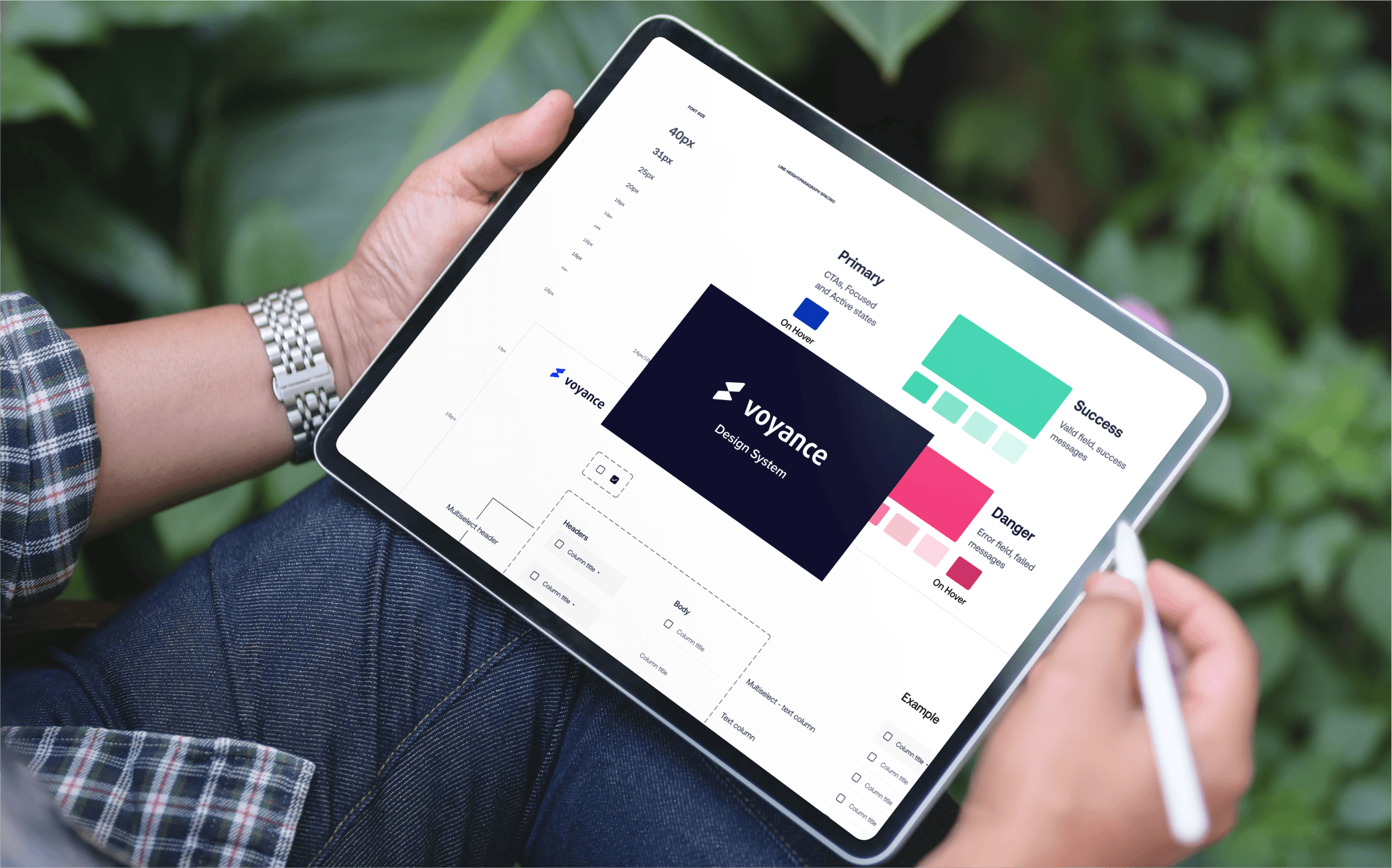
With the insights gathered from our research, we crafted a detailed strategy and roadmap for the redesign.
This roadmap included:
Phased Approach: We divided the project into manageable phases. The initial phase focused on defining core elements such as color palettes, typography, and iconography. Subsequent phases addressed more complex components like UI patterns, interaction models, and responsive design guidelines.
Timeline and Milestones: Establishing a clear timeline with specific milestones and deliverables for each phase, ensuring the project stayed on track and aligned with the overall business goals.


Design and Iteration
Design and Iteration
Auditing the existing design sytem
Auditing the existing design sytem
Auditing the existing design sytem
Auditing the existing design sytem
We conducted an audit of our existing design system to identify areas that needed updates or overhauls. Our team consisted of two designers, two front-end engineers, and a few marketing designers.
Splitting into two squads, we set out on a mission: one to scrutinize the current design ecosystem, while the other embarked on a treasure hunt for patterns and components used across all company products.
Key Findings
Key Findings
Key Findings
Key Findings
Through meticulous analysis, we identified foundational design elements like color palettes, typography, layout grids, and more that formed the backbone of our design ecosystem.
Through meticulous analysis, we identified foundational design elements like color palettes, typography, layout grids, and more that formed the backbone of our design ecosystem.
Through meticulous analysis, we identified foundational design elements like color palettes, typography, layout grids, and more that formed the backbone of our design ecosystem.
Through meticulous analysis, we identified foundational design elements like color palettes, typography, layout grids, and more that formed the backbone of our design ecosystem.
Design and Iteration
Design and Iteration
In the thick of it
In the thick of it
In the thick of it
In the thick of it
The design phase was marked by continuous iteration and collaboration.
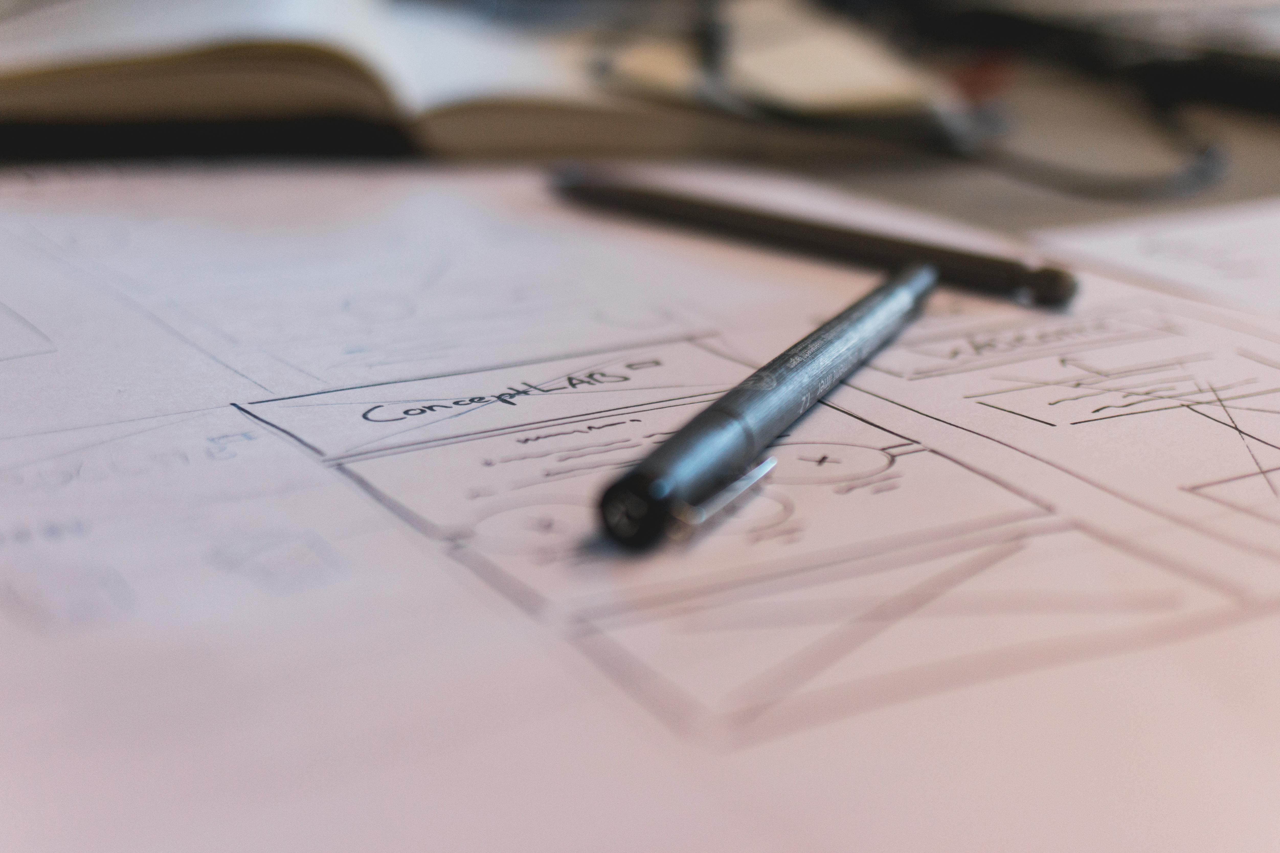
Wireframing and Prototyping: We started with low-fidelity wireframes to quickly explore different design directions. Once we had a solid foundation, we moved to high-fidelity prototypes to fine-tune the details.
Design Sprints: We used design sprints to rapidly test and validate ideas. Each sprint focused on a specific aspect of the design system, allowing us to gather feedback and make improvements iteratively.
Feedback Loops: Regular feedback sessions with stakeholders and team members ensured that the designs aligned with business goals and user needs. We used tools like Figma and Figjam to facilitate collaboration and gather feedback efficiently.


Colour
Colour
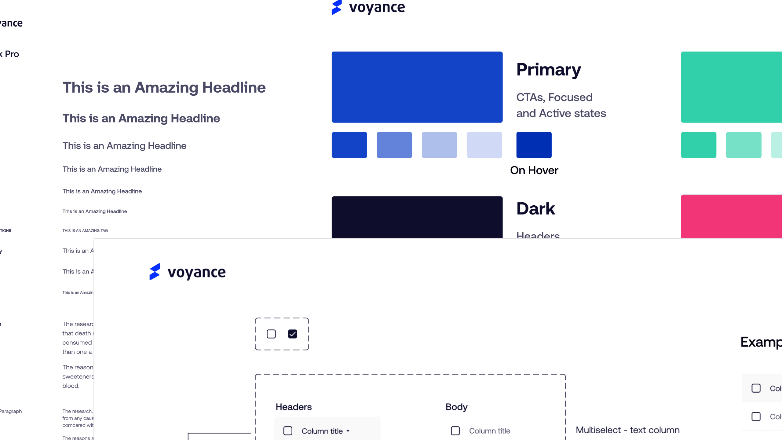
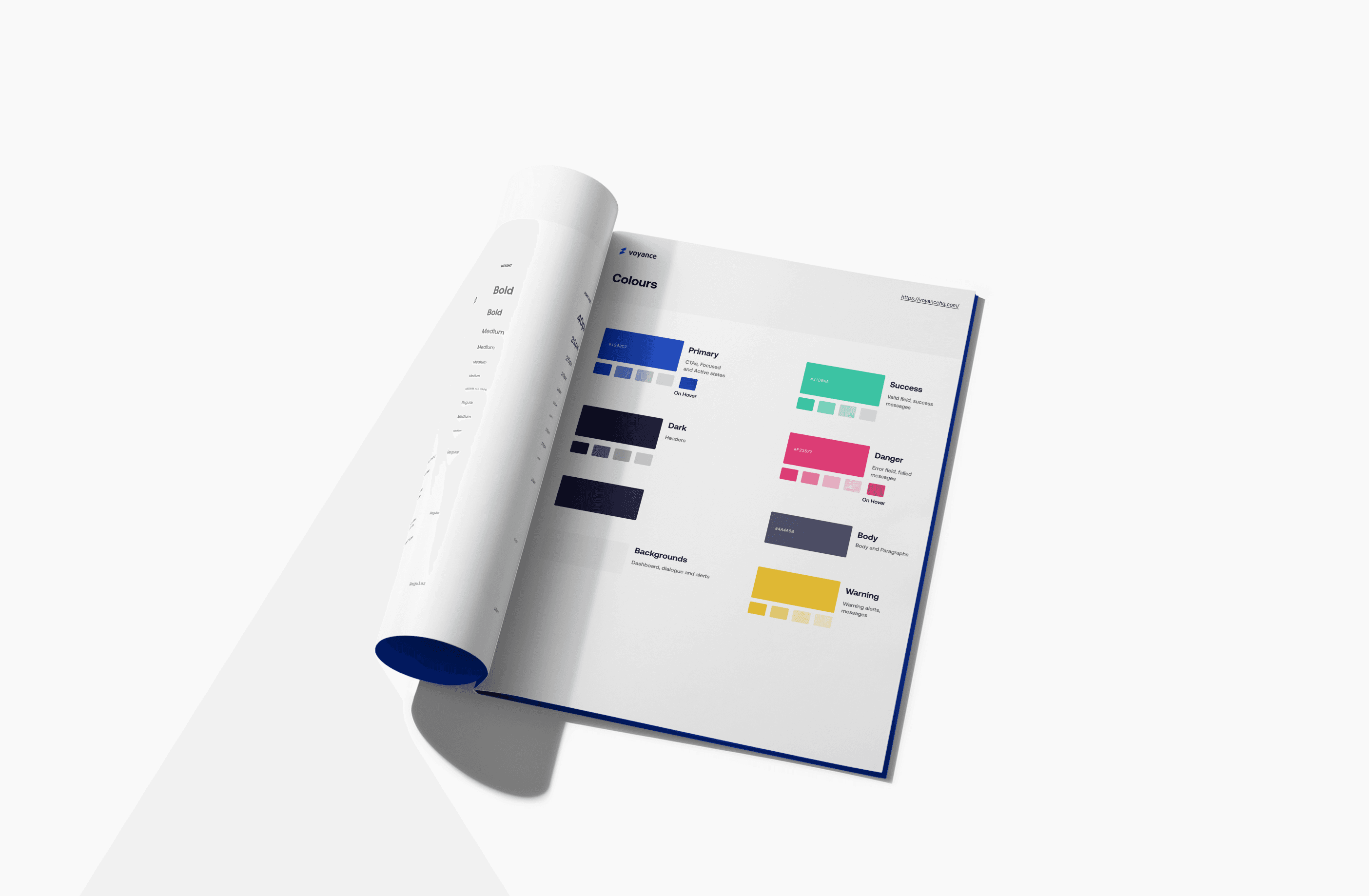
Since color is used to express style and communicate meaning, We created a color scheme of primary, secondary, neutral, warning, and success colors.
With foundation colors established, the Voyance design system had a full spectrum of colors needed for expressing interaction states, errors, and accessible contrast.
The primary foundation color is used to derive roles for key components across the UI, such as the prominent buttons, active states, as well as the tint of elevated surfaces.


Typography
Typography
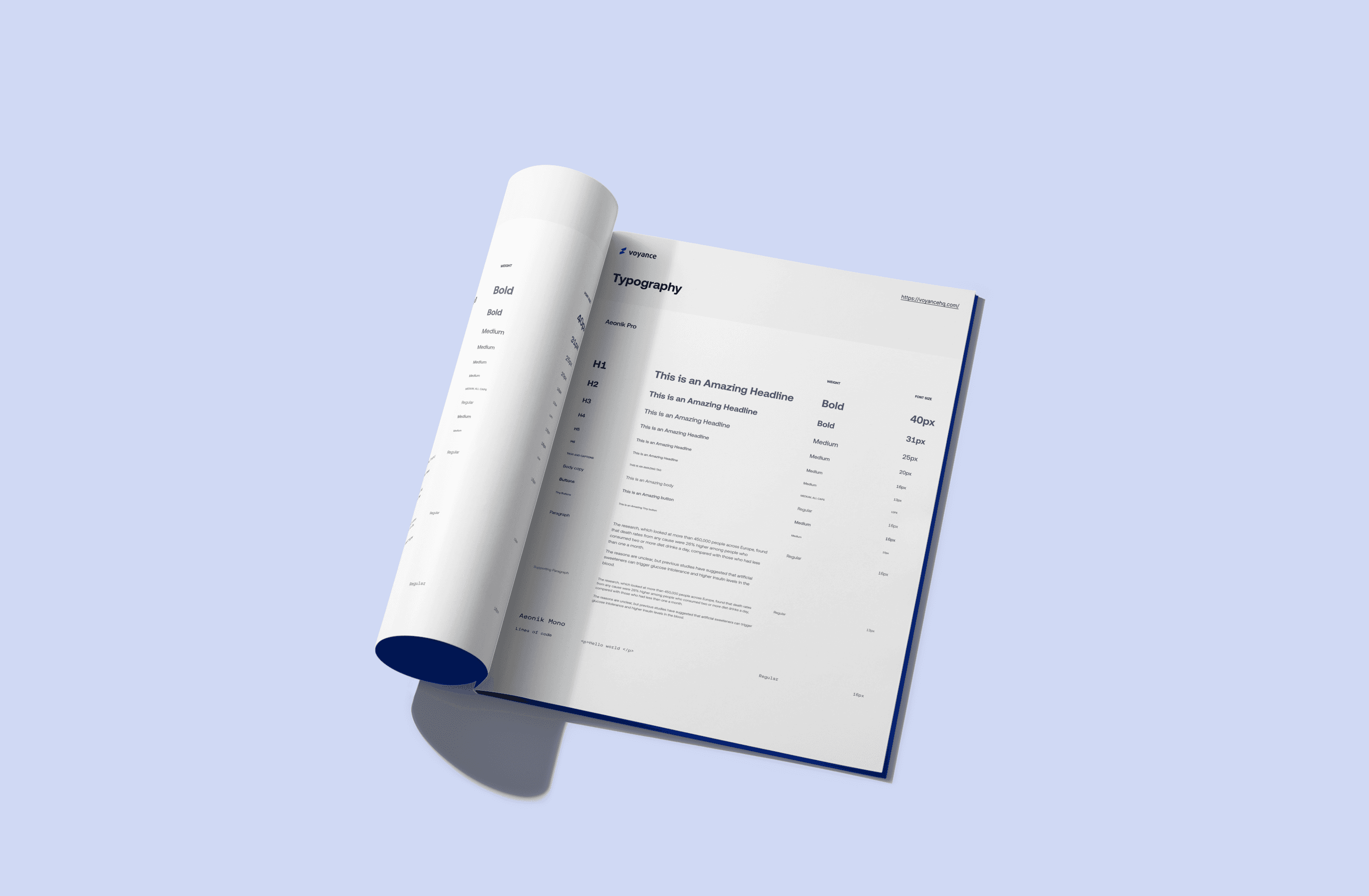
In version 1.0, the primary fonts were Proxima Nova with Courier Prime as secondary, but Proxima Nova didn't perform consistently at smaller sizes, especially when paired with icons.
After researching different font options, Aeonik Pro became the new primary font with Aeonik Mono as secondary. This decision was based on their balanced appearance across various sizes and screens, as well as their legibility and lack of odd characters.
A type scale was introduced based on a 16px base font size to improve visual hierarchy and readability.
Aeonik Pro also proved suitable for all-caps text, even at smaller sizes.


Buttons
Buttons
Buttons were designed to be either high or medium emphasis for important or common actions on a page.
The primary buttons are high emphasis, and the main actions are to search, create, or compose.
The secondary buttons are medium emphasis, and the main actions are to not distract users from other onscreen elements.


Other UI components
Other UI components
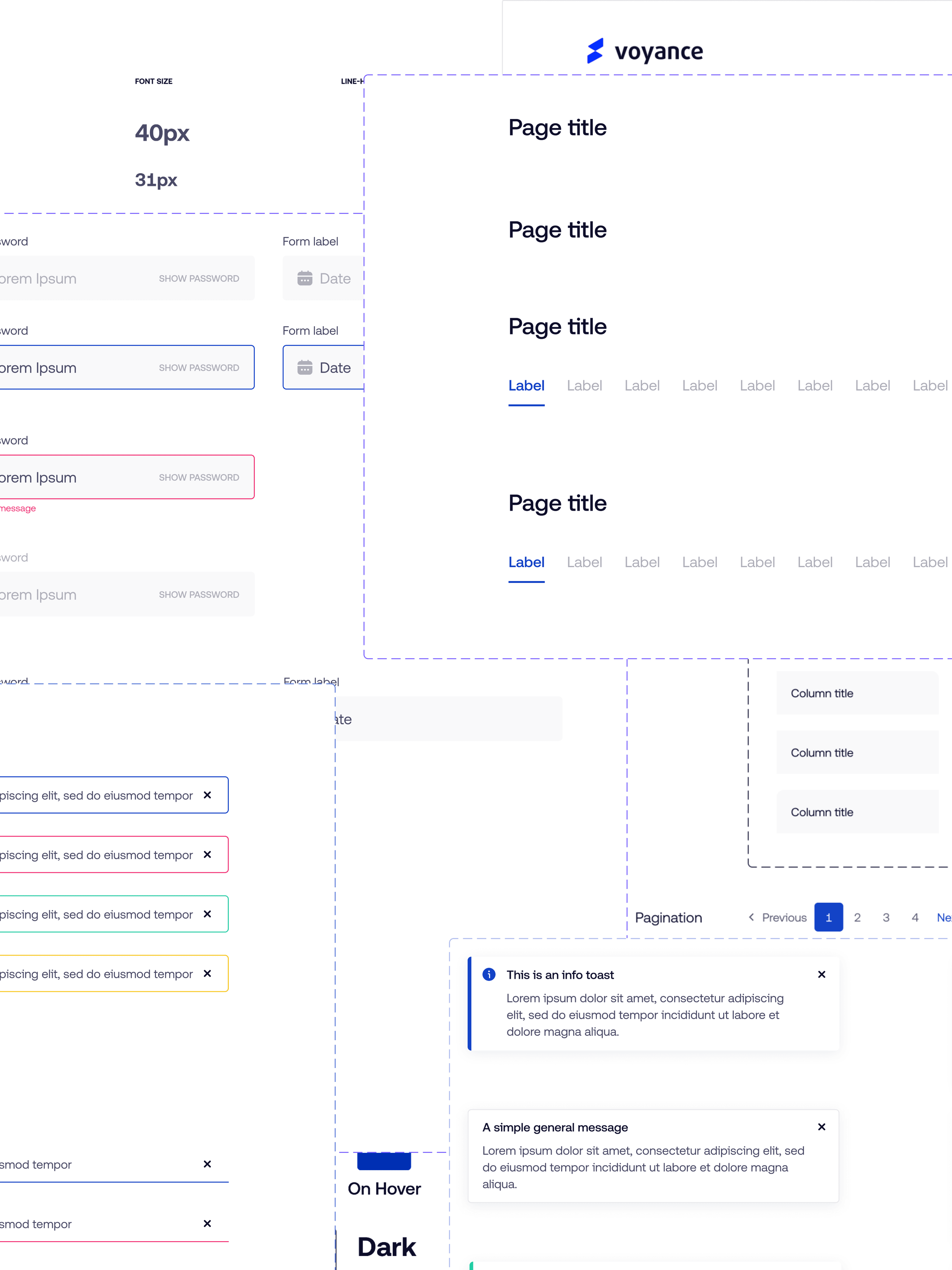
Once the foundation was set and we finalized all the foundational elements like color, typography, spacing, iconography, shadows and borders. We designed UI components that catered to the needs our products.
UI components like buttons, forms, alerts, toasts, banners, chips, cards, navigations, page headers and so much more
Collaboration
Collaboration
Following up
Following up
Following up
Following up
Collaboration was key to the success of this project. We fostered strong communication and cooperation across different teams.
Collaboration was key to the success of this project. We fostered strong communication and cooperation across different teams.
This involved;
Developer Partnership: Working closely with developers to ensure that the new design system was technically feasible and could be smoothly integrated into existing and future projects. Regular sync-ups and joint review sessions helped us address any technical constraints early on.
Marketing Alignment: Collaborating with the marketing team to ensure that the new design system reflected the brand's identity and values. This involved regular check-ins and reviews to align on visual and messaging consistency.
Documentation and Training: Creating comprehensive documentation for the new design system, including style guides, component libraries, and usage guidelines. We also conducted training sessions and workshops for designers and developers to facilitate the adoption of the new system.
This structured and collaborative approach ensured that the redesign process was thorough, efficient, and aligned with the company's strategic objectives. The end result was a robust and flexible design system that enhanced user experience, improved accessibility, and streamlined development workflows.
Challenges
Challenges
What kept us up at night
What kept us up at night
What kept us up at night
What kept us up at night
One major challenge was ensuring backward compatibility with existing products. This was crucial to avoid disrupting the user experience and to ensure a smooth transition.
We had to developed a migration strategy that allowed for gradual adoption of the new system without disrupting ongoing projects. This involved creating a comprehensive inventory of existing UI elements and mapping them to the new system.


Outcome
Outcome
It was all worth it
It was all worth it
It was all worth it
It was all worth it
The redesign of Voyance's design system resulted in numerous positive outcomes that significantly improved the company's digital products and processes.
The redesign of Voyance's design system resulted in numerous positive outcomes that significantly improved the company's digital products and processes.
Improved User Experience
Improved User Experience
Improved User Experience
Improved User Experience
The new design system greatly enhanced the user experience across all XYZ Corp products.
Consistency: By standardizing UI components and patterns, we achieved a consistent look and feel across all platforms, which improved user trust and satisfaction.
Intuitive Design: The refined design elements made interfaces more intuitive and user-friendly, leading to increased user engagement and satisfaction.
01
01
01
01
Increased Development Efficiency
Increased Development Efficiency
Increased Development Efficiency
Increased Development Efficiency
The streamlined design system led to substantial improvements in development efficiency.
Reduction in Development Time: We achieved a 30% reduction in development time for new features and products, as developers could now leverage a comprehensive set of pre-designed components.
Simplified Maintenance: The unified design system simplified maintenance and updates, reducing the time and effort required to make changes across products.
02
02
02
02
02
Enhanced Accessibility
Enhanced Accessibility
Enhanced Accessibility
Enhanced Accessibility
Our focus on accessibility resulted in more inclusive products.
Compliance with Standards: The new design system met and exceeded industry accessibility standards, ensuring that our products were usable by a broader audience.
Our focus on accessibility resulted in more inclusive products.
Compliance with Standards: The new design system met and exceeded industry accessibility standards, ensuring that our products were usable by a broader audience.
Our focus on accessibility resulted in more inclusive products.
Compliance with Standards: The new design system met and exceeded industry accessibility standards, ensuring that our products were usable by a broader audience.
Our focus on accessibility resulted in more inclusive products.
Compliance with Standards: The new design system met and exceeded industry accessibility standards, ensuring that our products were usable by a broader audience.
03
03
03
03
03
Stakeholder Satisfaction & Business Impact
Stakeholder Satisfaction & Business Impact
Stakeholder Satisfaction & Business Impact
Stakeholder Satisfaction & Business Impact
The project was well-received by stakeholders across the company.
Stakeholder Praise: The redesigned system was praised for its impact on both user experience and operational efficiency. Stakeholders appreciated the transparency and collaboration throughout the process.
Market Competitiveness: The improved design and user experience helped Voyance strengthen its market position and better compete with industry leaders.
04
04
04
04
04
Takeaways
Takeaways
What I learnt from this
What I learnt from this
What I learnt from this
What I learnt from this
Reflecting on the redesign of Voyance's design system, the key takeaways were the importance of collaboration, feedback and the need for flexibility. Working closely with different departments ensured we addressed a wide range of needs, while continuous feedback helped us create a design system that truly resonated with users. Managing the project's scope and keeping clear communication with stakeholders were essential for maintaining alignment and momentum. Embracing accessibility in the design system made our products more inclusive, and comprehensive documentation ensured long-term success. This project not only improved my communication and problem-solving skills but also deepened my empathy for users, reinforcing the importance of designing with their needs in mind.
Reflecting on the redesign of Voyance's design system, the key takeaways were the importance of collaboration, feedback and the need for flexibility. Working closely with different departments ensured we addressed a wide range of needs, while continuous feedback helped us create a design system that truly resonated with users. Managing the project's scope and keeping clear communication with stakeholders were essential for maintaining alignment and momentum. Embracing accessibility in the design system made our products more inclusive, and comprehensive documentation ensured long-term success. This project not only improved my communication and problem-solving skills but also deepened my empathy for users, reinforcing the importance of designing with their needs in mind.
